

Founder's Note Fall 2022
Six months ago, the idea of a “brand refresh” was brought up at our staff meeting and I was immediately intrigued about the idea of tweaking our logo…. Maybe even shifting our purplish-grayish color to more of a grayish-purple! My colleagues, however, had some additional thoughts relating to fonts, submarks (which I Googled), color suites, website copy and more. “NO!” I screamed inside while appearing to thoughtfully consider all of this… “What’s wrong with what we have… what I designed years ago, and why fix something that’s not broken!?”
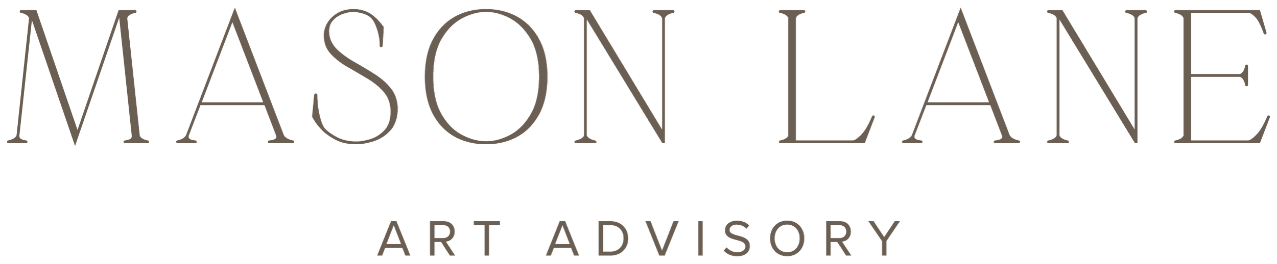
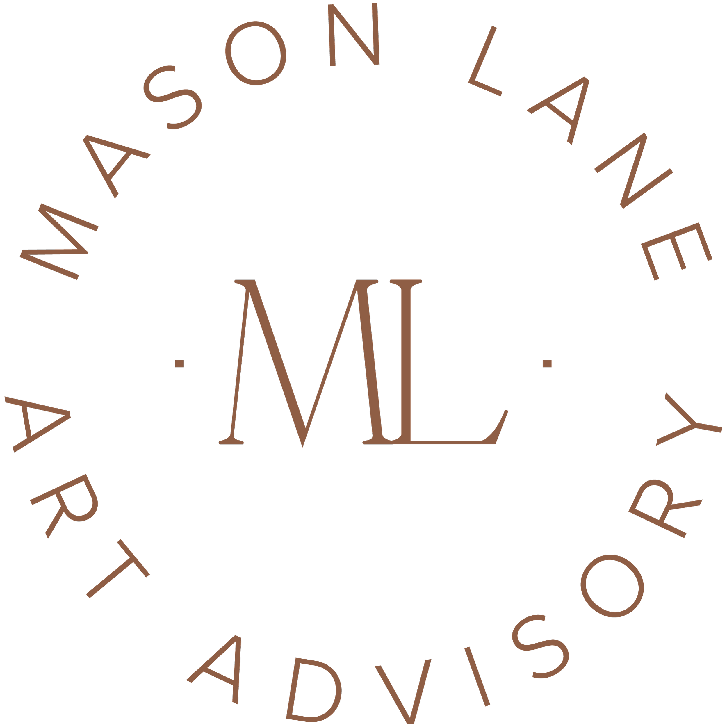
Well, eventually, I was a convert. The brand I established years ago does not reflect the level of expertise we have now and the clientele we service. Plus, the old branding represented a New York-only company. Today, we are truly a “We”, with offices in New York, Toronto and Minneapolis, advisors, associates and interns, and projects around North America. I’m grateful to my business partners - Kathy Ganley and Laura Mann - who encouraged this giant leap forward, and to the branding experts at LAB who helped us create the new Mason Lane.

What’s different?
Our visual identity: the color suite of creams, cedars, rust and charcoal have replaced the purplish-gray; our logo and coordinating sub marks are new, and the images showcased on our site and social channels is an edited selection of our best work. It all comes together to showcase who we serve and what we’re capable of doing. We hope you like the look.
What’s the same?
The people behind these visuals and the values we hold will always remain the same: at our core, we are a group of dedicated, collaborative, and intelligent women who value transparency, approachability and quality service. We take pride in our work as well as the relationships we build through it, and I’m grateful that our new visual assets so nicely mirror these internal ethos.
A Look Back…
Sharing this re-brand is a notable milestone for the company I established nearly nine years ago. In that time, there have been countless other milestones and setbacks. The first website I created had an all black background. (I wish I had a screen shot of that). Another iteration had the “Blank Walls Aren’t Fun and Buying Art is Tough” slogan. (Does anyone remember that!?) At some point, I tried to make 20 minute videos teaching people how to source art, and some projects inevitably have more unexpected moments than others. This is an unpredictable journey and I’m excited to celebrate where we are today and see what comes next.
Sincerely,
Katharine